UX-Tools
An archive for the preservation of collected resources.
Summary
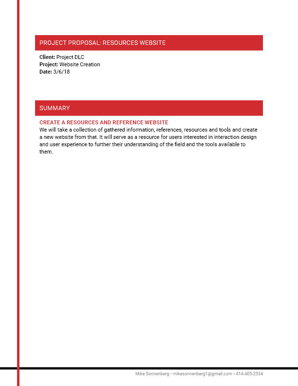
Goal: Collect, organize and preserve the wealth of resources collected by a cohort of interaction design students.
Concept: Take a collection of gathered information, references, resources and tools and create a new website from that. It will serve as a resource for users interested in interaction design and user experience to further their understanding of the field and the tools available to them.
Challenges: Information architecture, discoverability and usability. Taking a deep dive into how much context a user needs to inspire them to click on a link. Designing and building a system that delivers content.
Proposal
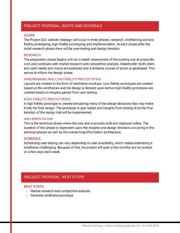
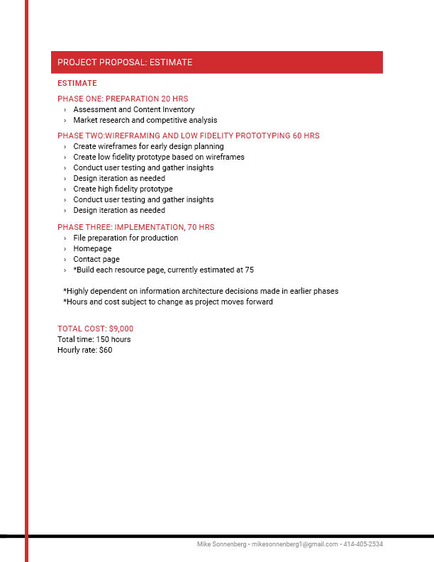
I began planning the project by creating a proposal document identifying each step and estimating the time required to complete it. The project was broken down into four phases: research/preparation, wireframing/low-fidelity prototyping, high-fidelity prototyping, and development.
Research & Preparation
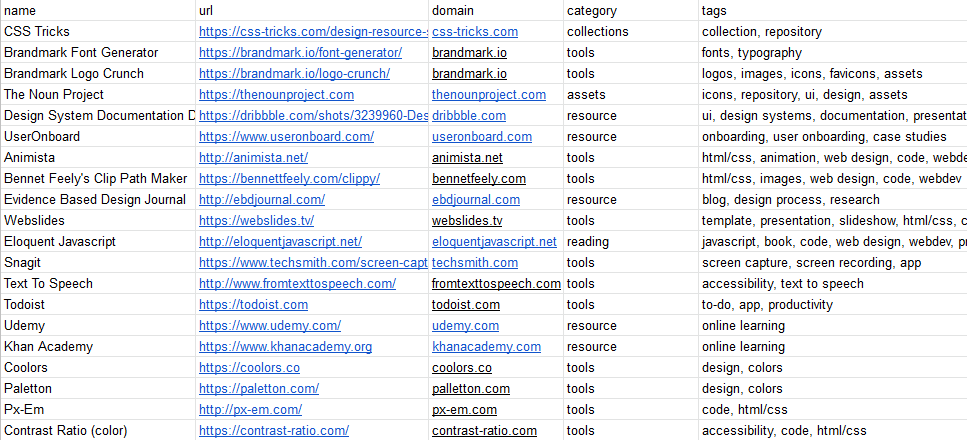
I began with scouring our cohort's Slack channel and performing a content inventory to get a better understanding of what I'm working with. Next was some desk research, examining other resource repositories and examining how they organize and present their content.
It seemed clear that some sort of categorization would be essential. Broader categories and more specific tags were added to the resources, with the intention of refining this initial categorization later through card sorting.
Wireframing
Wireframing was an opportunity to explore layout options and discover what informs those layouts through user testing. Two iterations on the initial wireframes (three versions total) were created.
Prototyping Goals
- Determine how much information is enough to prompt a user to check out the resource - minimum amount.
- Determine how much information is too much - the tldr point.
- Assess layout options.
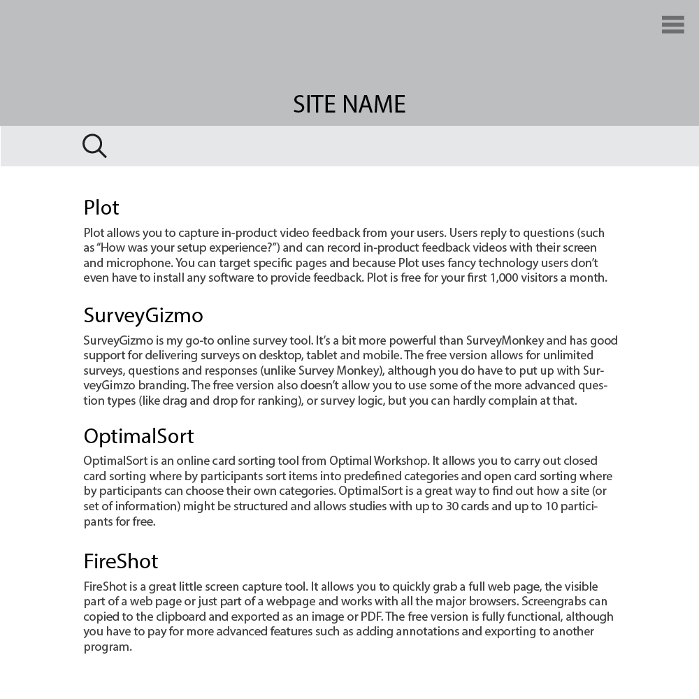
V1 Insights
- Text is too long, tldr.
- Layout is a bit plain, could be more engaging.
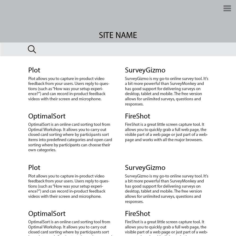
V2 Insights
- Overall layout change was positive.
- Length of text is better, but still a bit too long.
- Category navigation would be helpful.
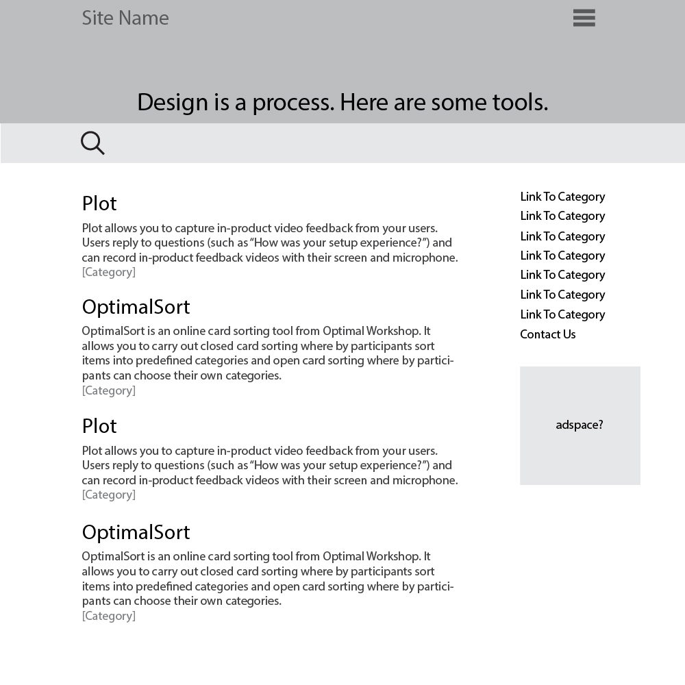
V3: Result
- Text length was shortened further, max length of 150-200 characters.
- A sidebar was added with category navigation.
- Category listing is included for each resource, something like a hashtag on a tweet.
- Reorganize the header a bit, final header design to be determined later.
High-fidelity Prototype
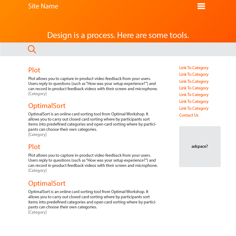
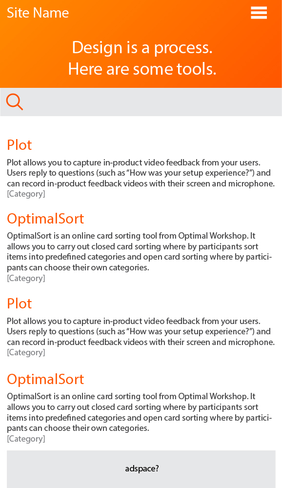
Near final design decisions are being made. A warm color scheme and simple header text. The content of the site is the star of the show.
Development (present state)
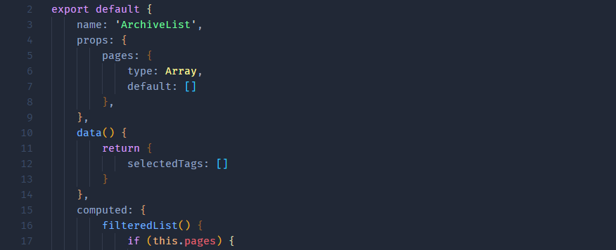
The site is being developed in vue.js. I hadn't intended to learn a javascript framework when this project started, but it seems like the right choice. The data already exists in a google sheet, which can easily be edited and exported as a json file. As future changes to the data (new entries,categories and tags) happen, it should make site updates relatively easy.