Hush
A hybrid smartwatch focused on mindfulness.
Summary
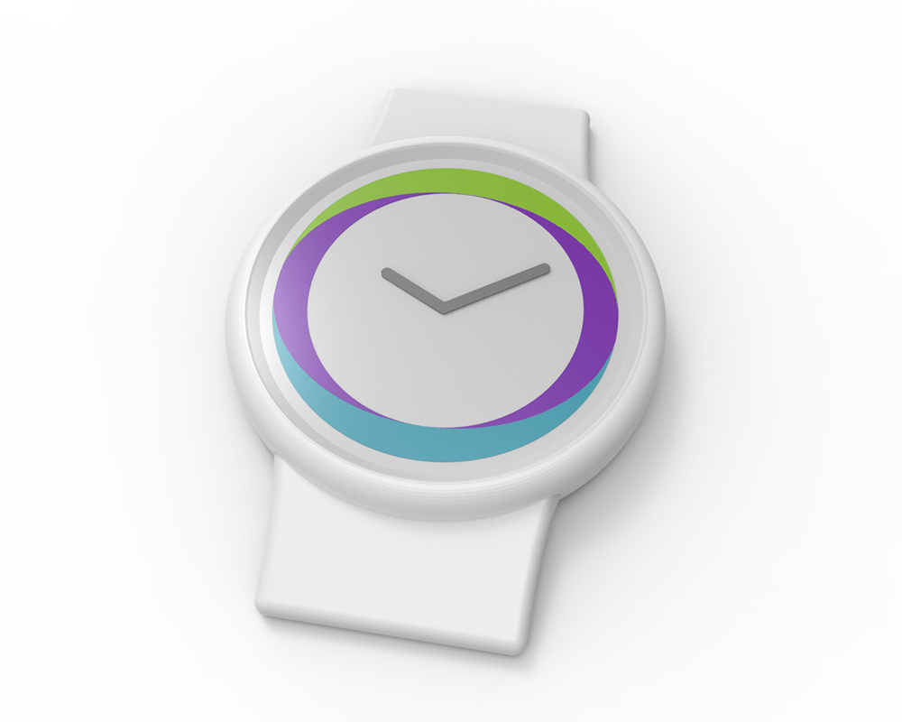
Concept: Hush is a hybrid smartwatch that enables greater control over the way notifications are recieved, creating a more mindful lifestyle.
Hybrid Smartwatch: A watch that looks and feels like a traditional analog watch, but has some "smart" features hidden under the surface. For example, a heartrate monitor in a watch connected to a phone via bluetooth.
Challenges: Redefining the role communication through technology plays in a user's life. Revealing how users prioritize communications and how to convey desired information at the appropriate time without unnecessarily interrupting them. Designing and user testing a UI within the constraints of a mechanical watch face, which is already a UI.

Inspiration
This project was inspired by a particularly frustrating moment of forced multitasking due to a barrage of communications. It was a moment where I needed to focus and get something done. In researching the issue I discovered that moments like this are very common.
Research
I discovered that, not only are moments of distraction common, they often go unnoticed. A few brief interviews were conducted and during one of them the subject glanced at her phone to check a notification. She wasn't even aware of the action when asked about it.
Initial interviews seemed to validate that there's a concept to latch onto so desk research followed.
Attention Theft
Aside from the annoyance of receiving too many notifications or at inconvenient times, being forced to multitask or switch the focus of our attention is physically unhealthy. It's called attention theft, which is defined as the intrusion on a person's attention by unwanted and unauthorized text, sounds, or images.
Further interviews with my previous subjects and shadowing one of them for a few hours shed more light on the issue.
Insights
- Regardless of what they're doing, people tend to check their phone automatically whenever they notice it beep or buzz.
- People want to be notified of certain things at certain times. For example, a text from their boss is desirable during the day but not on Saturday night at 9pm. Likewise, a tweet from a friend is an annoying distraction during working hours but it's a desirable notification in someone's free time.
Prototyping

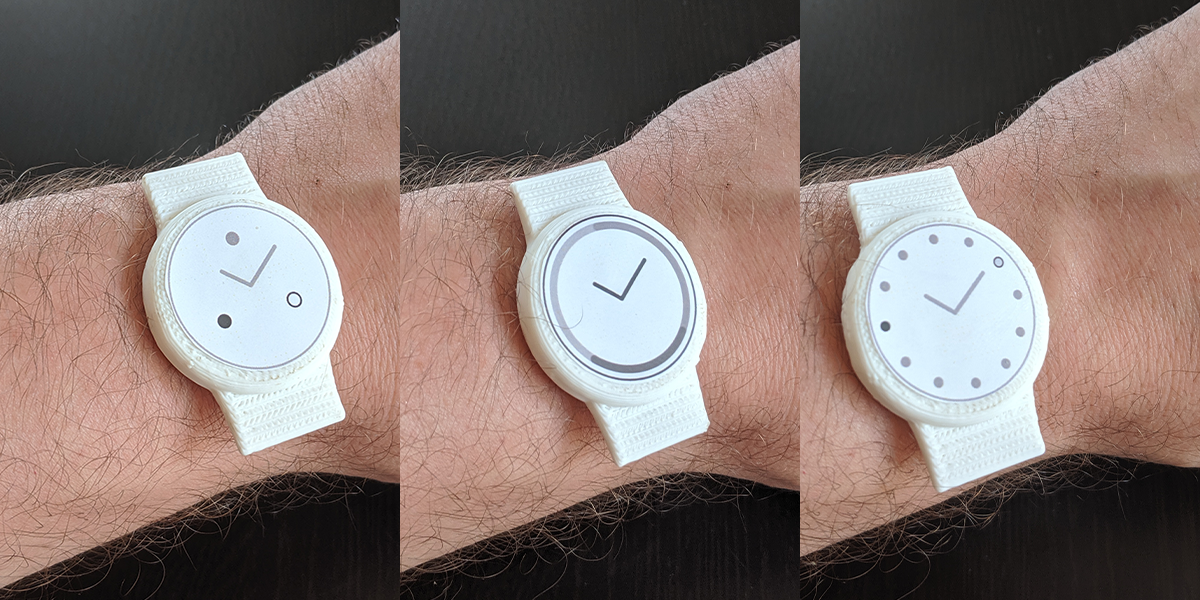
Several UI designs were affixed to a 3D printed watch model and tested. As it turns out, adding UI elements to an existing UI is fertile ground for user error and signal misinterpretation.

Insights
- Using the watch hands as UI elements is likely to create confusion.
- Using the numbers on the watch face as UI elements is similarly prone to misinterpretation.
- Avoid UI elements that may be interpreted as directional or pointing towards something...this also creates confusion.
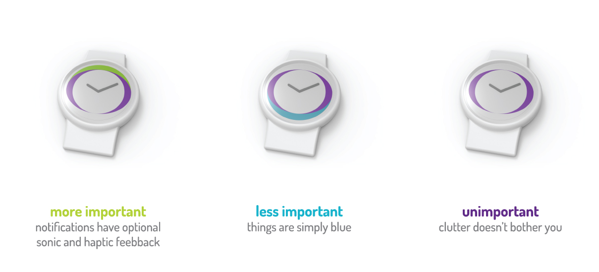
- Color can be a good indicator as it has no relation to existing hands/numbers on a watch face.
- Sonic and/or haptic feedback should be user-defined settings. Haptic feedback can be jarring to some, and sonic feedback may or may not be preferred depending on the user's local environment or personal preferences.
- Positioning elements above and below the center can communicate information, above = important, below = less important.
- Positioning elements left or right of center doesn't clearly communicate information, potentially open to interpretation due to personal left/right handedness.
Tangible Product: Hybrid Smartwatch

The goal of this concept is to reduce attention theft, and a hybrid smartwatch affords the functionality of a smartwatch without the hassle. This product's demographic isn't likely to want to add another screen into their lives, and a hybrid smartwatch doesn't have one. Since it doesn't have a screen the batteries can last up to six months between charges - one less thing to think about.
Intangible Result: Mindfulness

By providing the user with granular control over notification preferences they can recieve the notifications they want to receive, when they want to receive them. Create notification profiles like "work" or "weekend" to filter out the noise that isn't welcome at those times.